Infographic design

“Ooh, I do love a massive wall of text” said no one, ever in a million years. 

Your message is important. But when it’s difficult to understand, or contains an overwhelming amount of text, your audience switches off.

My infographics can simplify your (complex) information and make it more engaging. I can also create it using your branding, so everyone knows it’s yours. 

Infographic artwork

At least 65% of people are visual learners. We take in more information and remember it for longer when it uses engaging graphics instead of walls of text.

My infographics are designed to communicate with everyone. Including people who are neurodivergent, people with other disabilities and/or chronic health conditions, people with a different primary language, and people who are busy, stressed, hungry and/or tired.

They help your audience understand your message, remember your name and come back to your business again. 

Here’s one example of how my infographics have helped my clients:

Katie was an absolute lifesaver. She turned our research findings into catchy, bright and informative infographics with a very short turn around time. I couldn’t recommend her more.” – Nicole, The Hangleton and Knoll Project

Have you got some (complex) data that needs simplifying? Contact me for a chat.

An infographic with the text "Humans tend to be visual creatures. We take in more information and remember it for longer with engaging graphics rather than scary walls of text." Colourful illustrations show 1 of 10 stick people choosing a piece of paper with black text scribbles, with the other 9 choosing a picture of a boat. An arrow points to a brain from bar graph with a much bigger bar for pictures than words. An arrow points from some eyes looking at a picture and text to a page from a monthly calendar. An arrow points from a thought bubble containing a page of text and a question mark points to a day midway through the month. A second arrow points from a thought bubble containing a picture and a tick to a date at the end of the month. A pair of eyes with heart-shaped pupils look at a picture, next to a hand doing a thumbs up next to an increasing line graph. A person with a yellow warning sign over their head stands in front of a wall of brown and orange bricks. Words written on the bricks say “jargon, acronyms, expert terms, complex language”.

How does infographic design work?

Infographic design makes complicated things simple. They tell a compelling visual story about complex data, outside of language and literacy levels. Their benefits, include:

  • Engaging a wider audience
  • Reaching people and communities who are often excluded
  • Helping more people to discover you and what you do
  • Making you more memorable, because images are easier to recall than words 
  • Making your audiences’ lives easier, by sharing more accessible information

Put simply (which is totally my style), you’ll have more (and happier!) clients. And you’ll be happier too – as mentioned by my clients in their testimonials.
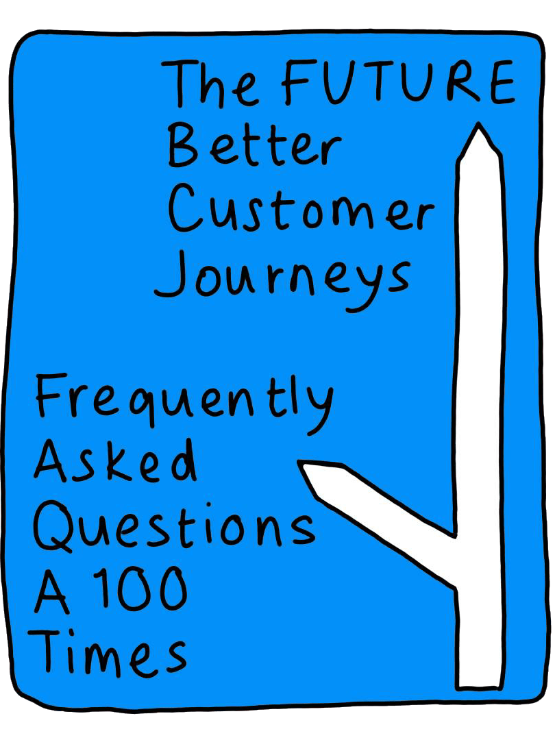
An illustrated road sign points towards a future of better customer journeys. The left-hand turn points to Frequently Asked Questions (FAQs) asked 100 times.

Why infographic design is a good thing

Are you answering the same client queries on repeat? The answers are probably obvious to you. But to your customers… not so much. 

Infographics deliver a simple explanation. With one glance, your audience gets it. You save time, and so do your customers.  

I know your business has achieved brilliant things. If you need some help telling your customers about them, let’s chat. 

A white infographic on a purple background surrounds the text "Helping organisations discover + learn how to best support staff with caring responsibilities". Images above the text shows a magnifying glass pointing to an office building, next to a person holding a small child with a weight resting on their shoulders. Below the text, 2 people have a supportive conversation with a heart in a speech bubble, next to a person pointing at a board while giving a presentation to 3 people, and a lightbulb pointing to a hand that is supporting both a person working at a desk and the weight they were carrying.
An infographic drawn in black on a brown paper background explaining that a refill shop works in the same way as a supermarket, selling food and household items in online and high street shops, with delivery and click-and-collect services. It explains the differences are that refill shops sell products without plastic packaging (by using reusable containers instead), price products by weight (so you can buy exactly what you need) and that Harriet of Hove's products are all plant-based and mostly organic. The illustrations include Harriet of Hove's storefront, tinned beans and toilet roll, empty boxes and jars and a set of weighing scales.
A page from Brighton and Hove Food Partnership's 2025 impact report titled "Our 2025 in numbers". The page shows the number of people supported, the attendee numbers for their cookery classes and events, their volunteer hours and details of their gardening groups. The data is accompanied by images showing 2 people having a chat, a tin of tomatoes, a plant pot growing a seedling, a trowel, a packet of seeds, a shopping basket, an apron and some bunting. The numbers are written on the associated images.
A page from Brighton and Hove Food Partnership's 2025 impact report titled "Our 2025 in numbers". The page shows the numbers of people who visited the clubhouse and responded to surveys, follow them on social media, and participated in their community composting scheme. It notes the total number of compost tumblers and locations, community garden plots and orders of sustainable meat boxes. The numbers are shown on images including an apple core, a person with a speech bubble, a hot compost tumbler, a watering can, and a location pin turned into a carrot (for the city-wide food strategy).